Stroke Symptoms, Part 2 – BE FAST

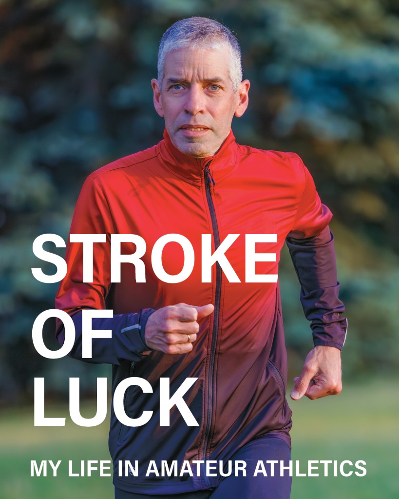
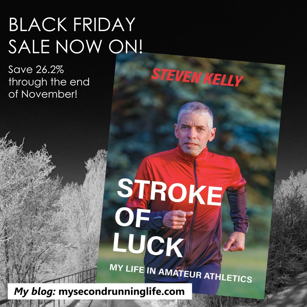
Time is running out! Get your copy of Stroke of Luck: My Life in Amateur Athletics on Amazon in the next few days at a marathon-inspired 26.2% discount

I recently wrote a piece about the common symptoms of stroke, and how public awareness campaigns, as effective as they are, can leave a gap in the number of strokes they help to detect.

I’ve been doing more reading on this subject, and turning up some interesting results.

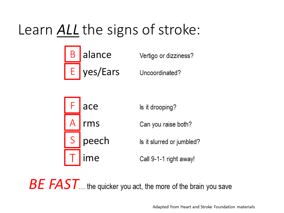
For years, the mnemonic F-A-S-T has been used to trigger us to recognize when someone may be having a stroke. Using this word, we should check the Face (is it drooping?), Arms (can you raise both?), and Speech (is it slurred?). “T” is for Time, as in don’t waste any before getting help.

Sounds good. But is it?

I mentioned in my previous piece that there’s more to the story. Why? Because F-A-S-T refers to ischemic strokes that occur in the carotid arteries. (There are two types of stroke: ischemic strokes, which occur when blood clots block flow in the arteries; and hemorrhagic strokes, which are associated with a rupture in a blood vessel.)

As a reminder, the carotids are the large arteries at the front of the neck. They account for about 80 percent of the total blood flow to the brain. In neurological terms, the carotids are the workhorses. And these are the arteries that, if they get blocked or damaged, can result in the symptoms noted above.

The balance of the blood flow to the brain is delivered in the vertebral/basilar artery system at the back of the neck. These arteries are smaller and they deliver blood to different parts of the brain. Not surprisingly, blockages in this network of arteries produce different symptoms. When vertebral blood flow is restricted, problems with balance and coordination of the eyes and the limbs can occur.

It has been recognized that a modified mnemonic would help detect strokes that occur in the vertebral arteries. BE FAST is already being recommended by some healthcare agencies as a more comprehensive trigger. Here, “B” is for Balance, and “E” is for Eyes (or ears). That makes sense to me, especially as I was having precisely those symptoms for weeks before I acted on it.

A study done by the University of Kentucky Stroke Center suggested that 14 percent of stroke patients were not identified using FAST. When BE FAST was applied, the proportion of identified strokes that were missed dropped to 4 percent.

In other words, more strokes could be caught if a wider screen were in use. Coincidentally, but maybe not, the number of strokes missed by FAST more or less matches the proportion of blood flow to the brain that originates in the smaller, but still important, vertebral arteries.

Another article I read recently on CNN Health addressed the different presentation of strokes between men and women. Interestingly, women may experience other stroke symptoms, beyond the parameters of even the broader, BE FAST, mnemonic.

Research summarized in the CNN article has shown that women may present with atypical stroke symptoms or symptoms that are more subtle and vague. In some cases, symptoms such as severe headache, generalized weakness, generalized fatigue, shortness of breath and chest pains, nausea and vomiting, brain fog, and even hiccups, may occur instead of or in addition to the symptoms noted above.

As to the reason why men and women experience stroke differently, scientists have come up with different theories. First, it’s about hormones. Age is another factor. There are other possible explanations too. I recommend reading the article to get the whole story.

It goes without saying that any symptoms that suggest a neurological problem should be acted upon immediately. No one ever needs to apologize for flagging a problem that may turn out to be nothing. It really is a case of being better safe than sorry.

As a final point, I’ve been spreading the word about stroke symptom cues when I speak to my running friends. There’s something appropriate about advising runners to BE FAST. After all, this should be an easy phrase for them to remember… it’s what they’re trying to do already!

Luck… and Good Light

Don’t forget my Black Friday sale, through the end of November. Get your copy of Stroke of Luck: My Life in Amateur Athletics on Amazon for a marathon-inspired 26.2% discount!

Photography can be a curious hobby.

Sometimes pictures are everywhere. Other times you feel that you have lost the plot. Try as you might, it seems there are no worthwhile subjects at all. 

The last few weeks have been tough for a variety of reasons. Time hasn’t been on my side, due to work and volunteer commitments. Cameras have been sitting idle. And it doesn’t help that my motivation has been running low. Maybe it’s a seasonal thing. With the shorter days, finding an interesting scene… just finding any light at all… is difficult. 

But here’s the good news. Whatever light we have at this time of year is often stunning. Any decent sunrise or sunset can be an easy capture because you don’t have to be up at an ungodly hour to shoot it. We are blessed in Calgary to have plenty of picturesque shots, thanks to our frequent Chinook arches

As if to remind me to snap out of my little funk, I’ve had several fortunate scenes appear before my eyes in the last week. 

One day, the light in the house was suddenly and strangely pink in the late afternoon. I looked outside, and the sky was glowing a magnificent rosy shade.  I almost tripped down the stairs to grab my Ricoh GR III. Quick, get out there! Shoot something! 

Admittedly, the firefighter across the street at the No. 5 Fire Station was slightly surprised to be the subject of my random shot, especially as he was walking to the rubbish bin. It didn’t matter. I wasn’t looking at him but at the amazing pink clouds above his head. A firestorm above the firehall. Easy!

No. 5 Fire Station, Fiery Sunset (November 2023)

Then, a few days later, as I picked up some things at the downtown Staples, I was drawn to a scene I’d passed many times. The setting sun was dipping below a Chinook arch and casting a golden glow over the skyscrapers. More awesome light. Again, shoot something. Anything! 

Looking east along the CP rail line, the tracks make natural leading lines. My challenge in the past has been in finding something to lead to… something other than a moving train, that is. 

Then I spotted my subject. A guy on a cool fixed-gear bike with bright green wheels was heading north on 11th Street. Standing in the middle of the street, I felt a bit exposed. I fumbled for my iPhone 14. C’mon man… hurry! I snapped my picture at the last split second, just as he entered my scene. Then I hustled out of the reach of the oncoming cars. 

Later, when I sat down with my pictures, I was more than happy with the results. With what had been snap-and-dash shots, I managed to get a couple of keepers.

Green Wheels, Golden Hour (November 2023)

Luck and good light. 

Just goes to show that you have to always be ready. And never give up. 

What Makes a Good Photograph?

Most of us carry a camera around every day and make liberal use of it. There are surely more photos being generated now than at any time in history.

It’s obvious that the vast majority of these photos are meant for instant consumption. They aren’t expected to be great, and 99.99% of them aren’t.

Anyone who has a sincere interest in producing photographs that stand out from the crowd faces a real challenge.

So what makes a good photograph?

Maybe we can try to check a few boxes. Is the picture well composed; is it sharply focused; is it properly exposed? In other words, we might be tempted to conclude that technical quality is essential for a good photograph.

But these metrics don’t tell the whole story. On one extreme, Ansel Adams is known for technically perfect photographs. But, for every technical purist, there is a photographer who is more intuitive. Think of Robert Capa’s iconic photos from the Normandy beaches on D-Day. They aren’t perfect, but no one could deny they are iconic photographs.

If a photograph has emotional impact, then we will likely be willing to overlook any technical flaws.

One of my favourite bloggers, the late Tim Vanderweert, wrote a number of pieces on aesthetics. I went back and read some of the excellent pieces on his Leicaphilia website. Tim had the breadth of understanding of philosophical concepts that let him dig into the works of Leibniz, Hume and Kant, in order to try to explain the foundations of what we perceive as beauty.

The essence of Tim’s observations, which I’ve significantly simplified for my purpose, is that aesthetic judgements are neither objective nor subjective. (Only Tim could make the connection between the classical philosophers and our modern perceptions of art in general, and photography in particular. I’m glad he did.)

Even if they don’t resolve the question, these concepts help explain why one person’s sense of what makes a good picture is different from others.

I’ve learned a few things when it comes to photography. First, I have to trust my instincts. I look around constantly. I try to be ready in case a scene develops in front of me. And most importantly, if a scene attracts my attention, I reach for a camera. This hastily taken photograph in Calgary’s Masters Gallery is an example. I’m pretty sure I didn’t do more than guess at my settings. The result is far from perfect technically, but I think it works.

Borduas and Friend (Leica M3, 2022)

Second, I’ve learned to make my best effort to get the technical bits right, then do a careful job of editing until I like what I see. Maybe it’s colour, form, a humorous scene on the street, an interesting cloud formation, or something else. Maybe I shot the picture on film or on my phone. Maybe I have to crop the original to highlight what I saw. It doesn’t matter. Whatever it was that made me take the picture, select it from among all the others, and then labour over it in Lightroom is probably worth seeing to a conclusion.

Third, I’m getting used to not seeing much of a reaction from Instagram, probably because most users on that platform (for reasons unknown) are more interested in pictures of my lunch. And that’s okay too. It’s just that I don’t usually see any merit in taking pictures of my food when there’s so much more out there.

Subway escalator, San Francisco (Olympus OM-2, 2019)

I guess I didn’t answer the question. But at least it’s fun to keep exploring.

Downtown Wildlife “Photo Run”

A reminder that Stroke of Luck is now available. Click here for details.

I often feel that I’m rewarded with photo opportunities as long as I have a camera close to hand. Last week I made a rare trip into downtown. It was a day after the first blast of winter in Alberta. The snow was still falling. 

I’d walked by the Harley Hotchkiss Plaza next to the courthouse many times, and I’ve always admired the Joe Fafard sculpture (Do, Re, Mi, Fa, Sol, La, Si, Do). It is a special installation… large, dynamic and colourful. 

Fafard (1942-2019) is known for his large sculptures, which often feature animals and play with perspective. Many of his works are humorous and they always show his keen wit.

Fafard produced the eight horses that comprise this work from powder-coated 5/8” steel plate in 2010. There is a duplicate of the piece installed in le parc Notre-Dame-de-la-Garde in Quebec City. Apparently, Fafard used laser-cut steel pieces salvaged from his other works to create the horses. Up close or at a distance, they are fantastic.

I’ve taken pictures of Fafard’s sculpture a few times, but each time I found the size and breadth of the piece (not to mention an often busy background) made it hard to photograph. On this day, though, the snowy scene was a perfect monochromatic backdrop. I stopped for a few shots with my Ricoh GR III. 

When I edited my photo, I made use of the latest masking features in Lightroom. Adobe says these are based on AI. Whatever they did, they made the process quite intuitive. It saved me a lot of time in this case, because I visualized the photo with the intricate figures separated from the background. To make the horses stand out even more, I reduced the saturation in the background. 

Here is the result. I hope you like it. (Yes, it is a slight cheat, but I figure that since the horses are running, I can officially call this session a “photo run”.)

Do, Re, Mi, Fa, Sol, La, Si, Do by Joe Fafard (2010)

A little further north on 4th Street, I stopped again. This time, it was to admire the massive mural of a peregrine falcon on the south side of the building at 441 5th Avenue SW. The piece is by Jerry Rugg, who is known in the world of muralism as birdO. Rugg is a multidisciplinary artist based in Toronto. His beautiful mural was done for the Beltline Urban Mural Project (BUMP) in 2021.

birdO works on canvas, in digital print, and installation, but he may be best known for his large-scale mural work on walls and buildings around the world. This is a great example. I love this piece, and I especially like the way it brightened up an otherwise cold, grey day.

As in the previous photo, I toned down the saturation in the background, which was admittedly already desaturated. This let the brilliant colours in birdO’s mural shine.

Peregrine Falcon, BUMP mural by birdO (2021)

Speaking of Joe Fafard, I can’t resist including a closing word about him. There are several impressive Fafard pieces around Calgary. My favourite is Van Gogh Observes, a monumental piece which can be found outside Masters Gallery on 4th Street SW in Mission. According to the gallery’s description, it is one of Fafard’s largest pieces.

This shot is from my archives. I was lucky to capture Van Gogh, apparently engaged in conversation with a passing couple in 2020.

Van Gogh Observes by Joe Fafard (2018)