While flipping through some recent pictures, I realized I was “seeing” them in either black & white or colour. This was before I had started doing any editing. My mind seemed to be jumping to conclusions about the end result.
Maybe this was inevitable, as I must have “seen” some version of the final image before I pushed the shutter button. Was my initial visualization strong enough to override any subsequent artistic choices?
I try not to limit myself to one expression or another, and I take plenty of photos in each style. My preference is for black & white images. Many of the photographers who have made an impression on me worked mainly in monochrome. Adams. Cartier-Bresson. Schaller.
That would be a good idea for a future piece… the photographers or the images that have been most impactful for me. But for this piece, I wanted to explore the idea of initial visualization and see if that process might be acting as a barrier to my artistic ideas. I picked several recent images, more or less at random, for the following, non-scientific analysis.
Sedona Landscape
The first image was a landscape, highlighted by the setting sun and building clouds over the peaks in Sedona, Arizona. There’s no doubt I imagined this image in bold monochrome. I shot it using my favourite JPG setting in the Ricoh GR III: hard monochrome. The in-camera JPG looked promising, on the tiny 3″ viewfinder screen. I couldn’t wait to see the image in Lightroom.
I hadn’t even considered the option of a colour version of this image, but maybe I had been too hasty. I reimported the image and forced myself to ignore the monochrome button. This is a comparison of the two versions:
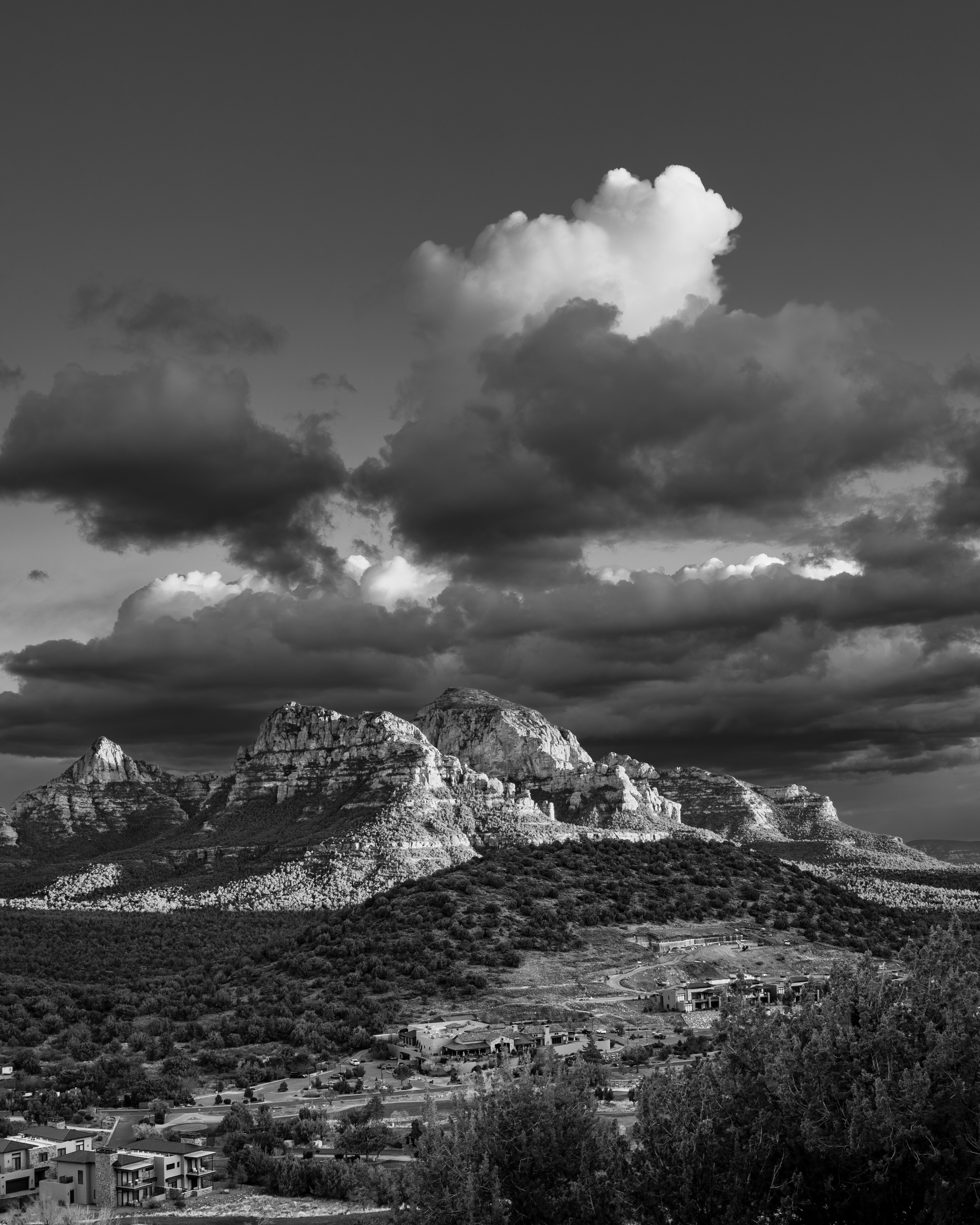
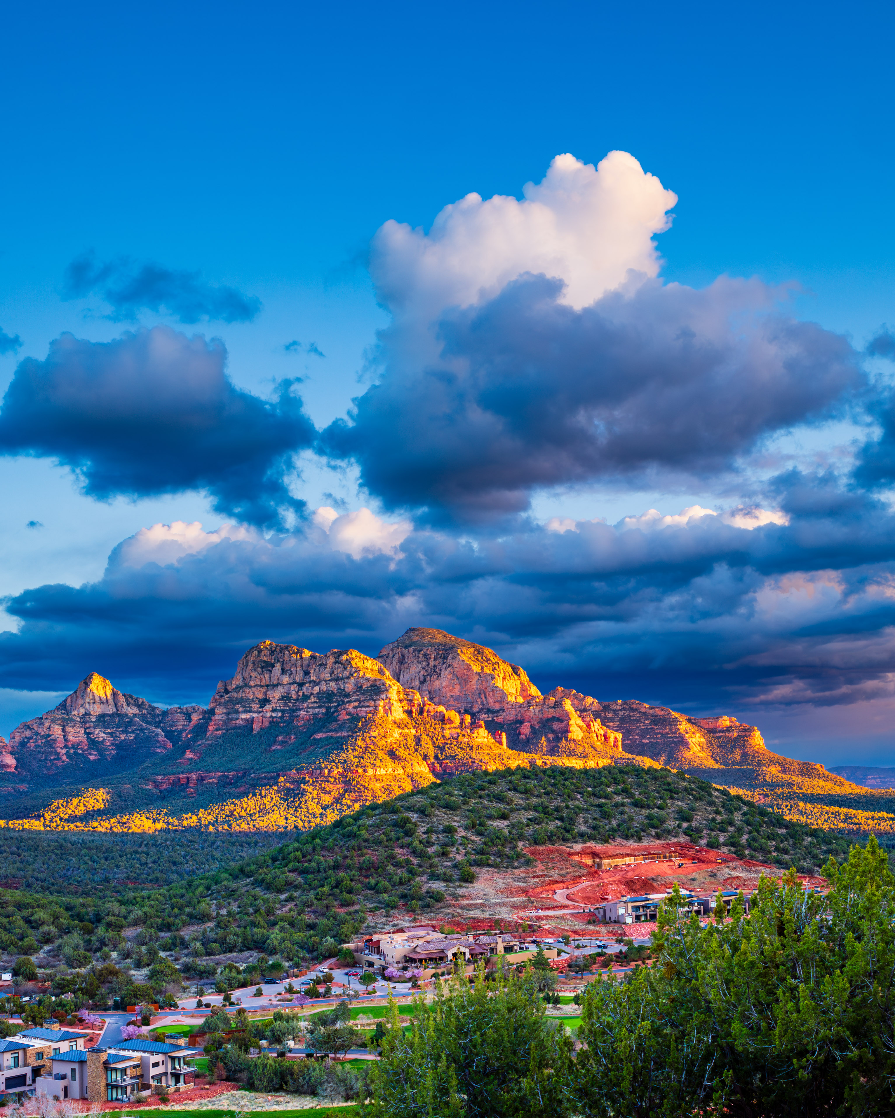
To my surprise, I found the colours in the foreground… the famous red rocks of Sedona… to be a distraction. This wasn’t the result I expected. The dramatic clouds, which I was able to set against the sky with a red filter effect, were hardly noticeable. Instead, they were competing for attention. I had to go with my first instinct. This photograph is better in monochrome.
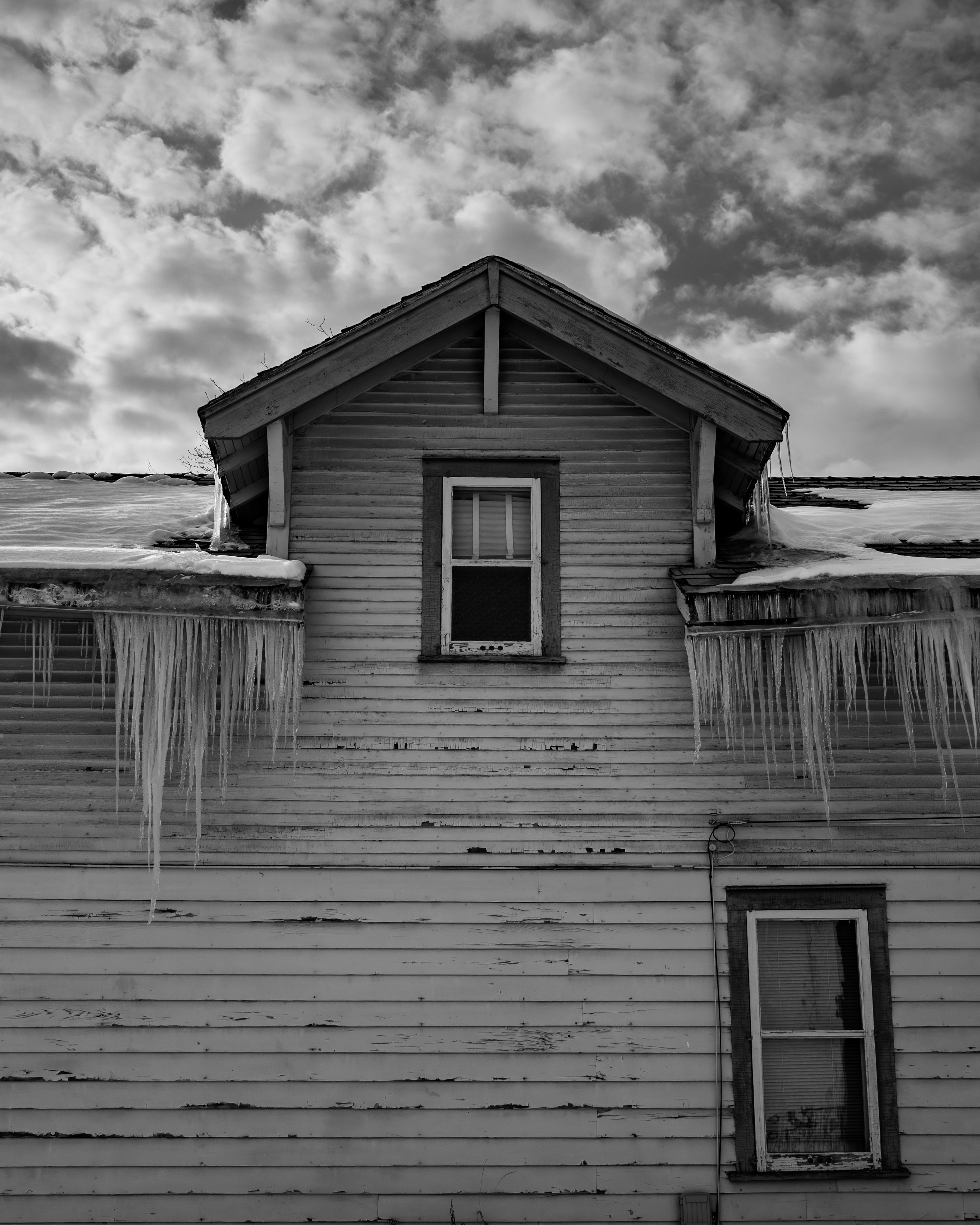
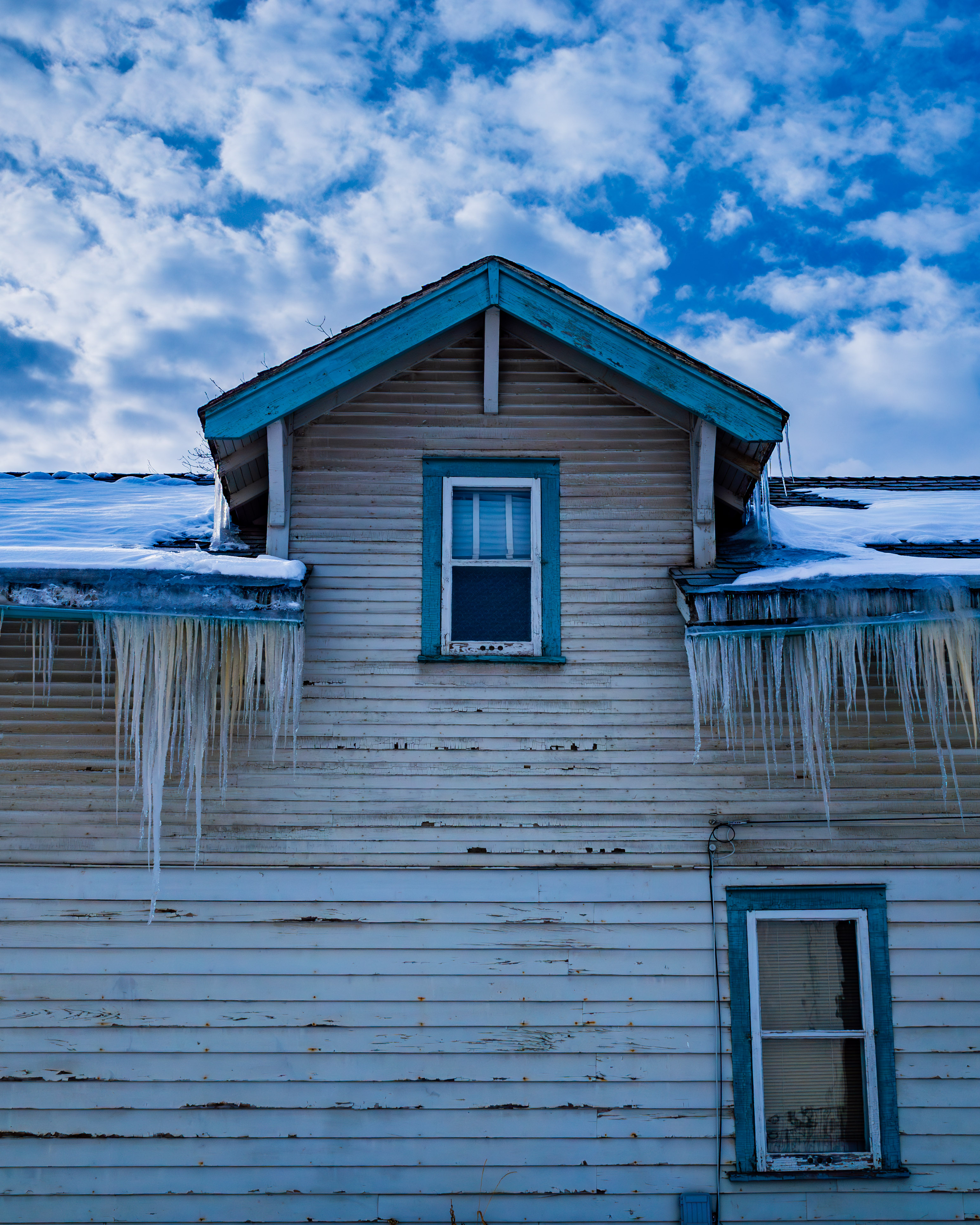
Cold, Icy Calgary
My second image was totally different from the picturesque scene in Sedona. We had returned to a late blast of winter in Calgary. It must have been some blast, based on the icicles that were hanging from every rooftop. A photo opportunity!
As with the landscape, I saw this roof and its crop of icicles in black & white. Texture and lines, contrasty clouds (where’s that red filter?) The thick icicles were a cool feature… no pun intended.
My monochrome image needed only a few edits: an increase in contrast and darkening of the sky. I also bumped up the exposure a little, to ensure the picture wasn’t a complete wash of drab grey. And I added a bit of texture to the peeling paint. This was just about exactly what I visualized when I took the shot.
But had I been too hasty? I had to find out. So I re-imported the RAW image and edited the colour version. I hadn’t even noticed the blue paint on the trim. And I missed the discolouration in the icicles from whatever had been oozing out of the eavestroughs. Time for some repairs.
What do you think?
Personally, I don’t like it at all. My mind’s eye was right to see this image in tones of grey. The colours are irrelevant to the story that this picture is telling. I wanted to put the viewer into a scene that was edgy, cold and stark. Instead, the pale blue trim on the house tempers the scene, while the brownish stuff coming out of the eaves is a distraction.
Springtime in Hamilton
My final image is from a recent visit to Hamilton. Walking around my old neighbourhood in April was a riot for the senses. Spring was in full bloom. I snapped a picture at the corner of (obviously) Maple Avenue and Province Street. I initially saw this as a colour picture, with a sunlit magnolia tree as the highlight.
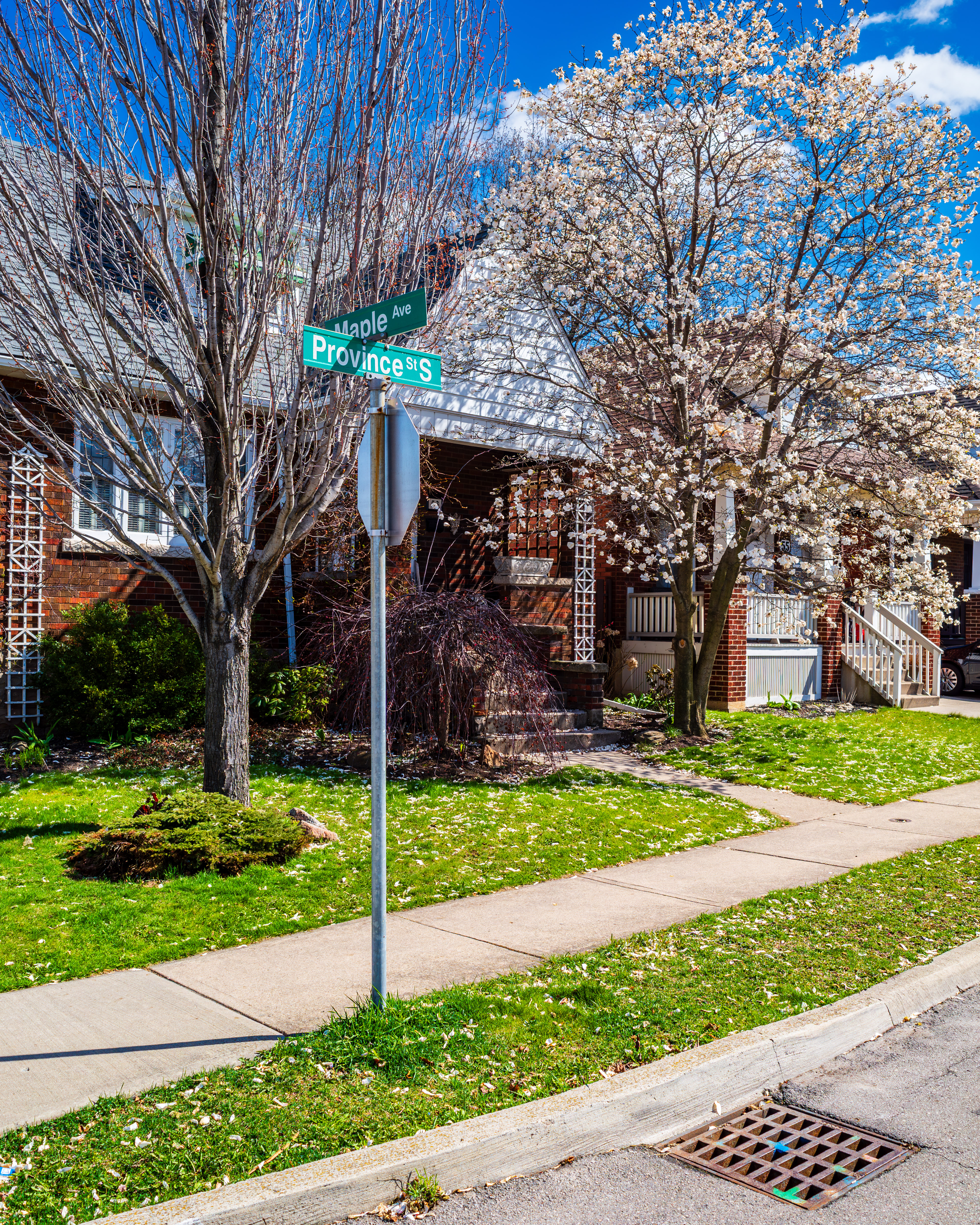
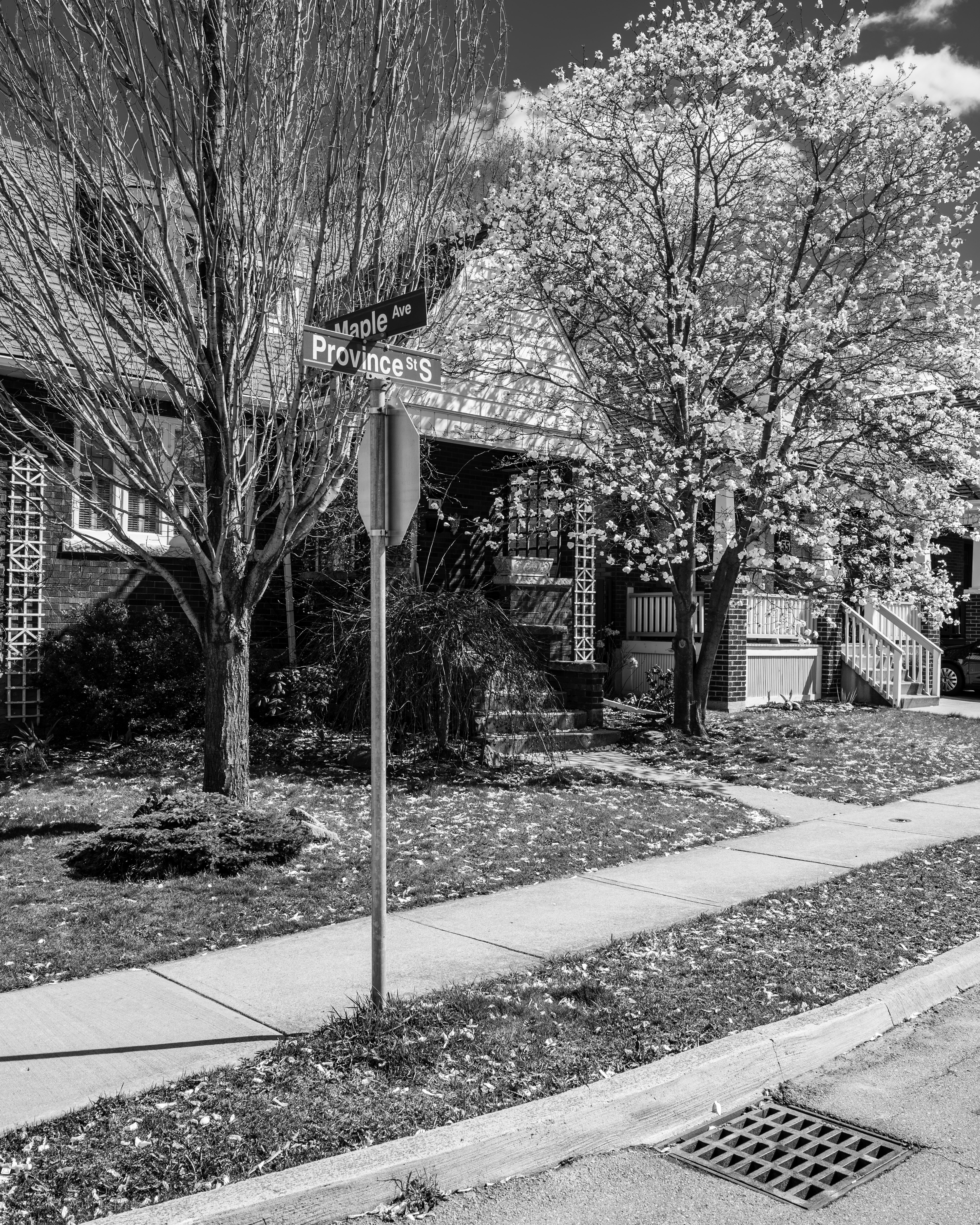
Even though I like the colour image, I decided to try a monochrome version. This one is more of a toss-up. I like both versions. Why? The colour version puts the viewer right in the scene. Spring has clearly sprung. On the other hand, the monochrome version shows us every detail but leaves us to imagine what colour everything is in the scene.
Of course, these are just my thoughts. Let me ask you: monochrome or colour? Leave me a reply in the comments.
Until next time, thanks for reading