Urban Sustainability? Hardly!

We live in interesting times in Calgary. I’ve formed strong opinions about what I see happening in my city. For many reasons, I think we’re on the wrong track. From what I’ve seen recently in other large Canadian cities, the same things are happening there, too.

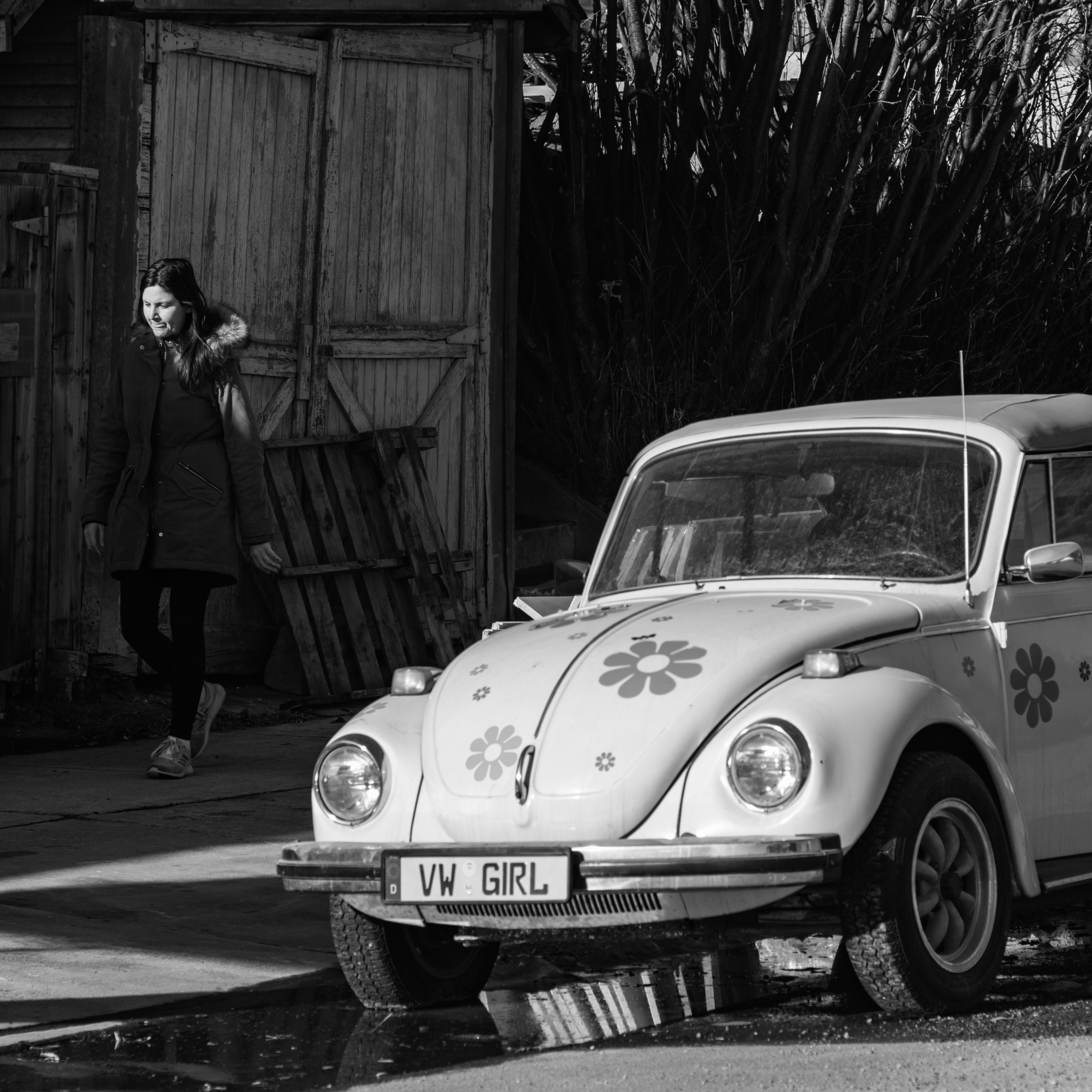
One of the first pieces I wrote for this blog was on the topic of sustainability. You can find it here. My focus then was on objects that are perfectly designed for their intended purpose. They are sustainable, in that they can be expected to work perfectly for a lifetime (or longer) if properly maintained.

As I walk around inner-city neighbourhoods in Calgary, I’m bothered by a pattern that I see being repeated over and over again. Homes that have stood for decades are being levelled and replaced by one of two things: large, contemporary boxes or large, multi-family boxes. And it’s not just homes. Commercial buildings are being torn down and replaced by high-rise residential towers full of small (you guessed it) boxes.

Boxes, boxes and more boxes…

Why is this happening? Well, it is now presented as common knowledge that housing is a critical problem in Calgary. City administration has prepared or commissioned studies to explain the situation and how dire it is. I’ve read their material, and I’m willing to admit that I don’t know. I’m not an urban planner or a sociologist. Maybe it’s a crisis, or maybe it isn’t.

What I do know is that if I exercise my right to ask questions or comment on proposed developments that directly affect me, by writing letters to my councillor and city planners, the usual response consists of boilerplate talking points about housing supply and affordability challenges. I used to write such letters, but I don’t do so anymore. When a response starts with the words “because we are in a housing crisis…“, then it will include justification for all sorts of irrational actions.

As I said, I have many problems with this trend, but let me come back to that word, sustainability. I define sustainability as encompassing the social, environmental and economic aspects of a project. In my view, nothing in the current teardown and build cycle is sustainable. I’ve noticed that the experts who tout densification and the bureaucrats who facilitate it—the same people who are quick to extol its benefits—tend to be silent on this point. This isn’t an oversight; it’s because the facts don’t fit their narrative.

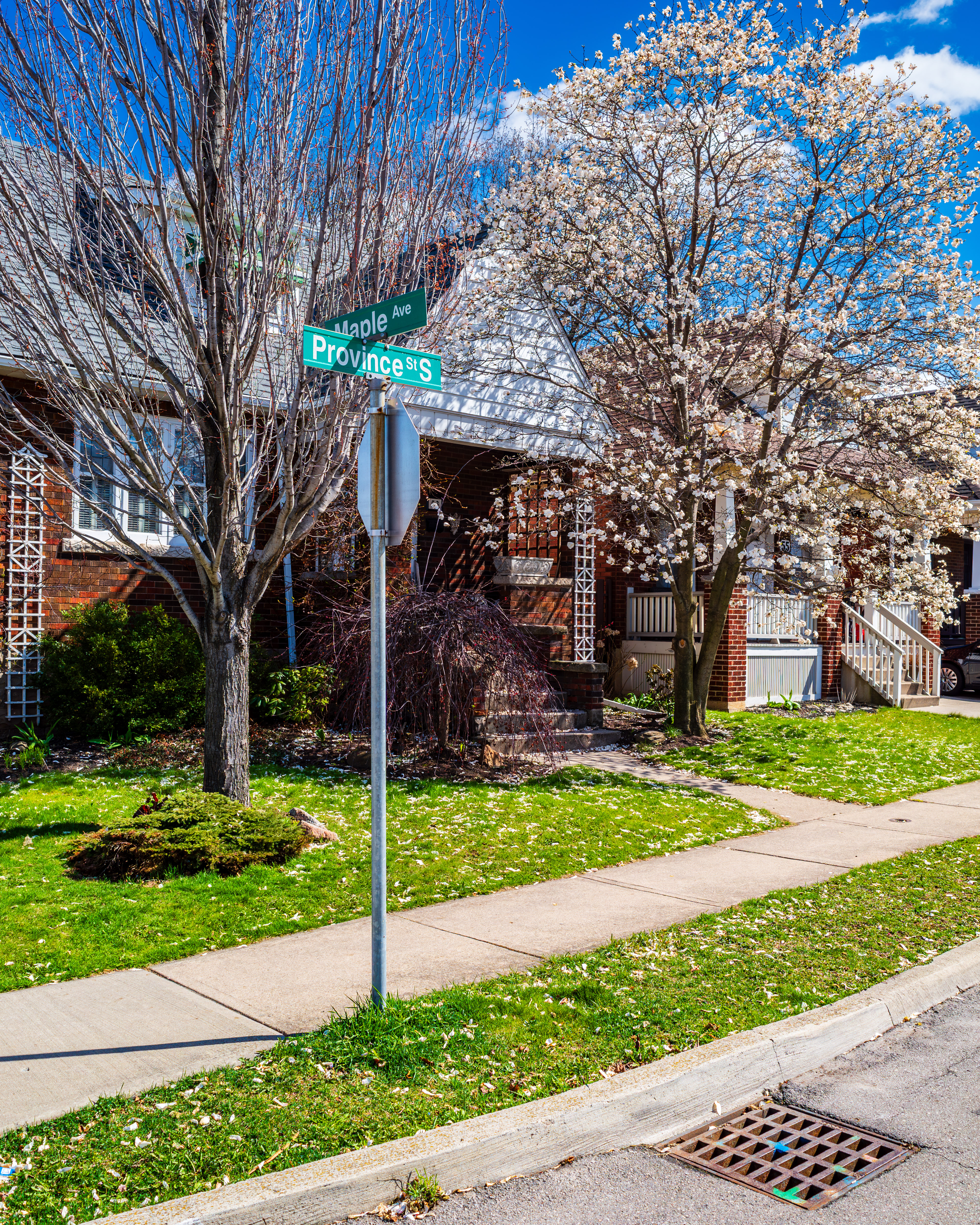
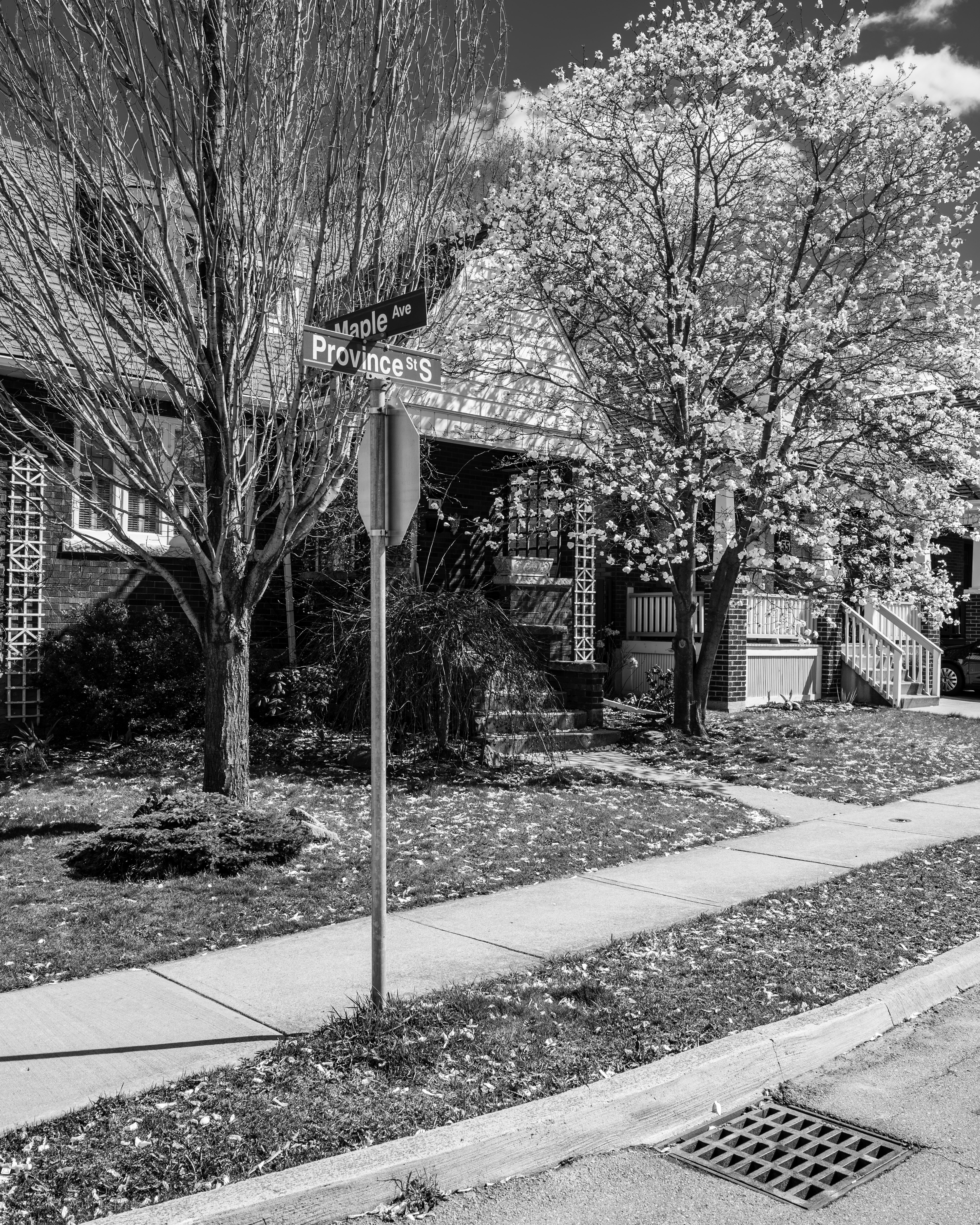
How about an illustration?

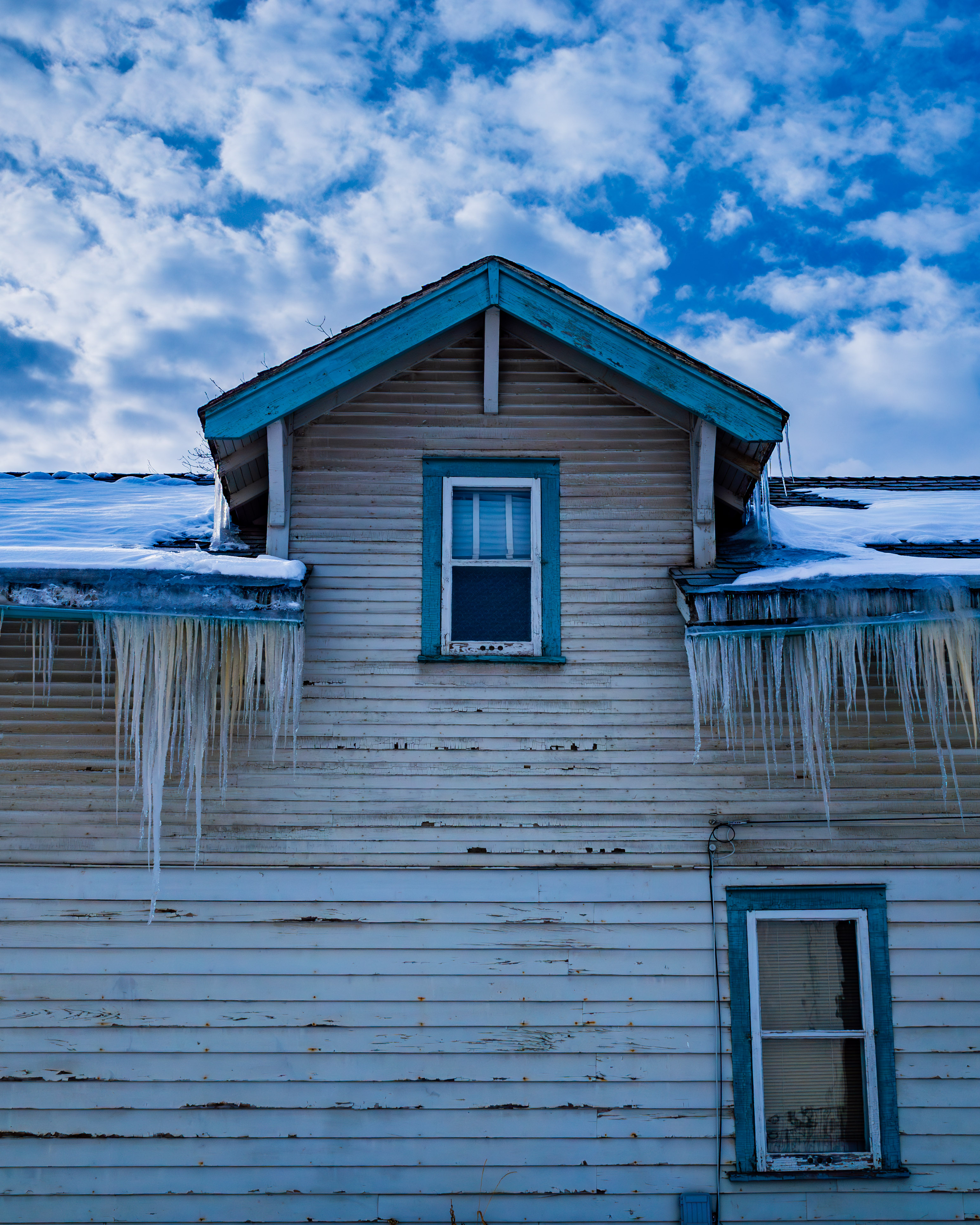
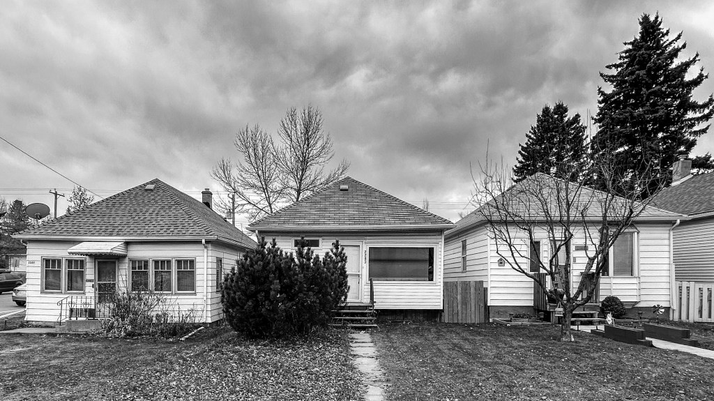
Yesterday, I walked by a row of three post-war houses. All were small, neat and well-kept. They have been standing for decades, so we know they have survived many brutal Calgary winters. The owners of these homes have replaced roofs, tended lawns, and done the hundreds of other routine tasks needed to keep them functioning. They have put their personal touches on them. These houses are not flashy, large, or modern, but they definitely are sustainable. On the evidence, these are the type of structures that stand in the way of solutions to our housing problem.

The impediments to solving our housing crisis… really?

Let’s contrast this scene with another, where a transition has already occurred. The houses that used to stand in this location were like the ones pictured above. They have been replaced by multiple, multi-family dwellings; in this case, four fourplexes.

Tell me, what problem is this solving?

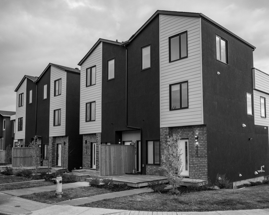
To get to this point, three houses were demolished and carted to the landfill. I estimate this would have generated 400 cubic metres (200 tonnes) of waste. That’s without consideration of the concrete foundations, which represent more waste to the landfill, and heavy waste at that.

Pouring new foundations generates significant GHG emissions, because cement manufacturing is one of the most GHG-intensive industries. Of course, there will be a continuous stream of waste while construction is in progress. And our lush urban tree canopy? Gone.

What are the main development scenarios for inner city locations?

If we see a custom contemporary house going up, it’s usually large and built to serve the needs of a couple or a small family. In other words, there will be a lot of space dedicated to a few people. Don’t get me wrong. This is a free country, and people can build to their own taste and budget. But on a full lifecycle basis, it’s hardly sustainable.

If it’s a multi-family dwelling, it’s almost certainly going to be built by a developer who will target the minimum building standards. There will be pressed board exterior walls, thin insulation and interior walls, plastic pipe and cheap finishings. Unlike the post-war houses pictured above, nothing built today will last. We can be sure of two more things: the developer will realize a healthy margin, and the finished units will not be affordable.

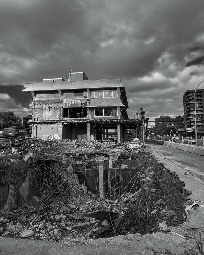
What about commercial properties? To round out my review, I checked the progress on the long-planned demolition of the Jimmie Condon Building at the corner of 17th Avenue and 14th Street. Some would say the building is (sorry, was) historic, and others would say its pagoda-style roofline was an eyesore. Either way, if a picture is worth a thousand words, then this one is a mouthful.

Off to the landfill, Jimmie!

We hear a lot these days about the need to build more “climate resilient” infrastructure. In response, I’ll note that I’ve seen plenty of buildings shrouded in tarps a few years after construction, presumably to repair deficiencies in exterior construction or incorrect materials. That is neither resilient nor sustainable.

I’ll leave for another day related questions—like whether multi-family dwellings (or high-rise towers) will solve the apparent housing crisis that led to their construction in the first place. Or who ultimately pays for luxury condo units that sit on the market unsold, or peddled as short-term rentals. Or whether we should be replacing our city’s already small inventory of historic buildings with characterless, cheaply-built boxes.

To conclude, there’s a saying that a good crisis should never be wasted. I think our municipal government and administration are doing just that with their housing crisis. Their logic is simple: the more housing units that are built, the more tax revenue will be generated. So inner city buildings are being demolished at a rapid pace, with no consideration of what makes our neighbourhoods unique or desirable.

This is a trend that’s hard to justify if one is thinking sustainably. We’re targeting one objective—increasing the supply of housing units—at all costs. In this context, “at all costs” means neglecting environmental stewardship and economic sensibility.

Fortunately, the market has a way of correcting irrational behaviour. I hope we will soon see evidence that a much-needed correction is underway.

On the Street with Hektor

This is a review of a camera lens that nobody uses. It might make sense to add up front that I’m not a reviewer of camera equipment. So, if there are no readers of this piece, the only loss will be the time I spent writing it. That said, I hope to introduce an unusual piece of equipment in an approachable way, even for non-photographers. 

So, what’s the story?

I have what might be described as a diverse collection of cameras and lenses. I don’t chase the latest equipment, and I don’t change my gear often. A lot of my gear is, well, old. The oldest and probably the oddest lens I own is a 70-year-old telephoto, made by Leica. It’s a lens that can be used on any M-series Leica camera made in the last seven decades. That’s quite remarkable when you think about it. It speaks to a solid legacy of product design.

For those who don’t fuss over cameras, Leica equipment is held in high regard… it’s considered to be an elite brand. In Leica’s rangefinder cameras (their “M” range), the products have a reputation for being practical, solidly built and efficient.

Except maybe for Hektor.

The Hektor is a medium telephoto lens, with maximum aperture of f/4 and focal length of 135mm. (That is the extent of the technical lingo in this review.)

The 1954 Leica Hektor 135mm f4

First off, 135mm happens to be a difficult… some would say unusable… focal length on Leica M rangefinders. Given my intention to keep this piece readable, I won’t explain why that is. But it is a serious knock against the lens. 

I’m going to lump a few other points together because they collectively contribute to the look of the lens. And how would I describe its looks? In a word, it’s unattractive. Okay, ugly. (That reminds me of the story that the Hektor is named after Leica lens designer Max Berek‘s dog. I wonder what that says about the dog.)

Anyway, the lens design, meaning the arrangement of glass elements inside the tube that forms the lens, is simple. In photographic terms, the f/4 aperture makes this a “slow” lens. This combination of design decisions means that the lens itself is long and skinny. I don’t really like the look (or the feel) of the lens when I’m walking around with it over my shoulder. 

As a further negative point, the Hektor is awkward to use. It is well-made and solid. After all, it IS a Leica lens. Still, when taking a photo, it’s hard to focus because it requires a lot of rotation of the lens barrel. This isn’t a lens for action photography.

With all those flaws, I might be advised to end my review here. But here’s the problem. I think it actually takes good pictures. Check out these examples:

These pictures all came out of the camera with soft contrast, kind of a “mid-century” look. Could that be the result of whatever combination of optics and coatings was put into the lens in 1954? Maybe. It isn’t necessarily a bad look. In fact, it may be exactly what one is looking for, especially for portraits. After some editing, the results look fine, at least to me. (I should add that the Hektor’s colour rendition isn’t good, so I usually use it for B&W shooting.)

I’ve used the lens for street photography, and it’s best for distant subjects… shots across a street, like “VW Girl”, above. Shooting with Hektor brings all the shortcomings I mentioned earlier into play. For that reason, if I’m using this lens I have to get my settings ready and wait for subjects to enter the scene.

The lens is quite sharp across the aperture range, even shooting wide open. Again, it should work well in portraiture. Given how slow it is, maybe outdoor portraiture would be the best bet.

I’ve read a few other reviews of this lens. Most bash it quite harshly. One review by a well-known online source is very negative. However, when one reads the full review, the reviewer concedes the many strong points the lens has going for it when taking pictures. And isn’t that what matters?

Wrapping up, the Hektor is a lens I rarely reach for. There are good reasons for that. But every so often, when I feel like giving myself a photographic challenge, I put it on a Leica M camera and take it out for a spin. I marvel at the fact that I can do that at all, with such an ancient piece of equipment. And if I’m patient, I usually come home with a shot or two that convince me to keep this oddball in my kit. 

Colour or Monochrome?

While flipping through some recent pictures, I realized I was “seeing” them in either black & white or colour. This was before I had started doing any editing. My mind seemed to be jumping to conclusions about the end result. 

Maybe this was inevitable, as I must have “seen” some version of the final image before I pushed the shutter button. Was my initial visualization strong enough to override any subsequent artistic choices?

I try not to limit myself to one expression or another, and I take plenty of photos in each style. My preference is for black & white images. Many of the photographers who have made an impression on me worked mainly in monochrome. Adams. Cartier-Bresson. Schaller.

That would be a good idea for a future piece… the photographers or the images that have been most impactful for me. But for this piece, I wanted to explore the idea of initial visualization and see if that process might be acting as a barrier to my artistic ideas.  I picked several recent images, more or less at random, for the following, non-scientific analysis.

Sedona Landscape

The first image was a landscape, highlighted by the setting sun and building clouds over the peaks in Sedona, Arizona. There’s no doubt I imagined this image in bold monochrome. I shot it using my favourite JPG setting in the Ricoh GR III: hard monochrome. The in-camera JPG looked promising, on the tiny 3″ viewfinder screen. I couldn’t wait to see the image in Lightroom.

I hadn’t even considered the option of a colour version of this image, but maybe I had been too hasty. I reimported the image and forced myself to ignore the monochrome button. This is a comparison of the two versions:

Evening clouds, Sedona (March 2024)

To my surprise, I found the colours in the foreground… the famous red rocks of Sedona… to be a distraction. This wasn’t the result I expected. The dramatic clouds, which I was able to set against the sky with a red filter effect, were hardly noticeable. Instead, they were competing for attention. I had to go with my first instinct. This photograph is better in monochrome. 

Cold, Icy Calgary

My second image was totally different from the picturesque scene in Sedona. We had returned to a late blast of winter in Calgary. It must have been some blast, based on the icicles that were hanging from every rooftop. A photo opportunity!

As with the landscape, I saw this roof and its crop of icicles in black & white. Texture and lines, contrasty clouds (where’s that red filter?) The thick icicles were a cool feature… no pun intended.  

My monochrome image needed only a few edits: an increase in contrast and darkening of the sky. I also bumped up the exposure a little, to ensure the picture wasn’t a complete wash of drab grey. And I added a bit of texture to the peeling paint. This was just about exactly what I visualized when I took the shot.

A good crop of icicles (March 2024)

But had I been too hasty? I had to find out. So I re-imported the RAW image and edited the colour version. I hadn’t even noticed the blue paint on the trim. And I missed the discolouration in the icicles from whatever had been oozing out of the eavestroughs. Time for some repairs.

What do you think?

Personally, I don’t like it at all. My mind’s eye was right to see this image in tones of grey. The colours are irrelevant to the story that this picture is telling. I wanted to put the viewer into a scene that was edgy, cold and stark. Instead, the pale blue trim on the house tempers the scene, while the brownish stuff coming out of the eaves is a distraction.

Springtime in Hamilton

My final image is from a recent visit to Hamilton. Walking around my old neighbourhood in April was a riot for the senses. Spring was in full bloom. I snapped a picture at the corner of (obviously) Maple Avenue and Province Street. I initially saw this as a colour picture, with a sunlit magnolia tree as the highlight.

Maple and Province, Springtime (April 2024)

Even though I like the colour image, I decided to try a monochrome version. This one is more of a toss-up. I like both versions. Why? The colour version puts the viewer right in the scene. Spring has clearly sprung. On the other hand, the monochrome version shows us every detail but leaves us to imagine what colour everything is in the scene.

Of course, these are just my thoughts. Let me ask you: monochrome or colour? Leave me a reply in the comments.

Thanks, Steve

What Makes a Good Photograph?

Most of us carry a camera around every day and make liberal use of it. There are surely more photos being generated now than at any time in history.

It’s obvious that the vast majority of these photos are meant for instant consumption. They aren’t expected to be great, and 99.99% of them aren’t.

Anyone who has a sincere interest in producing photographs that stand out from the crowd faces a real challenge.

So what makes a good photograph?

Maybe we can try to check a few boxes. Is the picture well composed; is it sharply focused; is it properly exposed? In other words, we might be tempted to conclude that technical quality is essential for a good photograph.

But these metrics don’t tell the whole story. On one extreme, Ansel Adams is known for technically perfect photographs. But, for every technical purist, there is a photographer who is more intuitive. Think of Robert Capa’s iconic photos from the Normandy beaches on D-Day. They aren’t perfect, but no one could deny they are iconic photographs.

If a photograph has emotional impact, then we will likely be willing to overlook any technical flaws.

One of my favourite bloggers, the late Tim Vanderweert, wrote a number of pieces on aesthetics. I went back and read some of the excellent pieces on his Leicaphilia website. Tim had the breadth of understanding of philosophical concepts that let him dig into the works of Leibniz, Hume and Kant, in order to try to explain the foundations of what we perceive as beauty.

The essence of Tim’s observations, which I’ve significantly simplified for my purpose, is that aesthetic judgements are neither objective nor subjective. (Only Tim could make the connection between the classical philosophers and our modern perceptions of art in general, and photography in particular. I’m glad he did.)

Even if they don’t resolve the question, these concepts help explain why one person’s sense of what makes a good picture is different from others.

I’ve learned a few things when it comes to photography. First, I have to trust my instincts. I look around constantly. I try to be ready in case a scene develops in front of me. And most importantly, if a scene attracts my attention, I reach for a camera. This hastily taken photograph in Calgary’s Masters Gallery is an example. I’m pretty sure I didn’t do more than guess at my settings. The result is far from perfect technically, but I think it works.

Borduas and Friend (Leica M3, 2022)

Second, I’ve learned to make my best effort to get the technical bits right, then do a careful job of editing until I like what I see. Maybe it’s colour, form, a humorous scene on the street, an interesting cloud formation, or something else. Maybe I shot the picture on film or on my phone. Maybe I have to crop the original to highlight what I saw. It doesn’t matter. Whatever it was that made me take the picture, select it from among all the others, and then labour over it in Lightroom is probably worth seeing to a conclusion.

Third, I’m getting used to not seeing much of a reaction from Instagram, probably because most users on that platform (for reasons unknown) are more interested in pictures of my lunch. And that’s okay too. It’s just that I don’t usually see any merit in taking pictures of my food when there’s so much more out there.

Subway escalator, San Francisco (Olympus OM-2, 2019)

I guess I didn’t answer the question. But at least it’s fun to keep exploring.

Fall Photo Run

It’s been a busy couple of months for your blog host. Between work and travel, there hasn’t been much time for a simple photo run in and around the neighbourhood. Knowing how short our autumn is here in Alberta, it looked like I might miss the whole season.

It was a pleasure to have a short window of opportunity a couple of weeks ago. So I grabbed the trusty Ricoh GR III, left my watch at home, and headed out on a perfect fall day.

Fall splendour was everywhere. Yellow leaves and green grass were on vivid display against the clear blue sky. Magical.

I ran by an elm tree in the corner of Wolfe Park, not far from home. I had to stop. The yellow leaves were glowing in the afternoon sunlight. Then, a minute later and only a few feet away, I came across a vintage trailer parked on the street. I snapped my pictures and finished my run, hoping that I had captured the feeling of the day.

The photos sat in the camera until this morning, when I finally got a few minutes to open them up in Lightroom.

The rich colour palette and stately profile of the elm tree did make for a nice photo. It was a classic fall shot of a fine-looking tree.

Elm tree in full sunlight, as we usually see it

But something seemed to be missing. My picture of the elm tree didn’t grab me as much as I had hoped. After all, the way it looked on that warm September afternoon had made me stop and reach for my camera.

I thought I would try the same shot in an infrared (IR) simulation mode that Lightroom conveniently offers. What’s that about, you may ask?

Well, the short answer is that IR shots respond to different wavelengths than the human eye. Here’s how it works. The human eye sees light in the 400-700 nanometre (nm) range, covering the colour spectrum from purple to red. IR light is in the range of 700-1200 nm; that is, beyond the visible spectrum. We can’t see IR light, but it can be captured (or as in this case, simulated) in photographs. Because the leaves of the elm tree emit light in the IR range, the yellow foliage is recorded as bright white. It can make for surreal images.

Here’s what the infrared version of the same photo looks like.

Same elm tree, simulated IR filter, as we can’t see it

I’m not sure which image I prefer. I like them both. I would never want to overuse the IR effect, given its other worldly look. Seeing the images side-by-side made me realize that there can never be anything that matches seeing nature in person. I am curious which image of the elm tree you prefer. Please let me know in the comments section, below.

As for the picture of the trailer, it was more straightforward to edit. I like the way that the blue of the trailer matches the sky. It’s a bonus that the curtains in the window of the trailer give the picture a distinct fall vibe, picking up the foliage in the background. But that’s just my opinion. What do you think?

Vintage trailer, Wolfe Park

I hope wherever you are, you are experiencing good weather and capturing lots of memorable photographs.

Enjoy.

Leicaphilia Loses its Creative Force

Tim Vanderweert passed away in early January. I need to say a few words about him, and the impact he had on me. In this digital world, it seems a stretch to say Tim was a friend because I never met him. I only knew him through his online presence and a bit of interaction we had through his blog, Leicaphilia. One thing is certain – I wasn’t the only person who was influenced by Tim.

It’s funny how things go sometimes. About five years ago, I was putting my life back together after a medical episode that left me wondering what my future would look like. Competitive running, which had been a constant presence in my life for more than four decades, looked like it might be taken away forever. I wasn’t sure I could cope with that prospect.

I had always had a passing interest in photography, but to be fair, it had never gone beyond a teenager’s early fascination with the gear and amateurish attempts to emulate the great landscape photographer, Ansel Adams. Boxes of family snapshots, as great as they are, attest to the fact that I focused more on quantity than quality. And that was fine, as I had limited time for hobbies, for all the usual reasons.

Fast forward to 2017. Adrift after a lengthy hospital stay and amid much uncertainty, I picked up my old Canon AT-1–that’s a totally manual film camera by the way–and started carrying it with me on my slow recovery walks around the neighbourhood. For years, I had cruised through the same streets at a faster pace – apparently fast enough that I hadn’t seen things that were right in front of my eyes.

My interest in photography was being rekindled but I was rusty. So rusty that I had missed the whole transition to digital photography, which had made film cameras obsolete. At least that was the conventional wisdom.

And then I discovered Leicaphilia, and its creative force, Tim vdW. Here was a guy, about my age, who had dedicated as much of his life and energy to photography – Leica-based film photography no less – as I had dedicated to competitive running. Different hobby, same passion. I liked him immediately.

The more I delved into Tim’s writing and creative output, the more our connection grew. I especially liked the fact that he steadfastly defended the turf of film photography against the onslaught of digital. Pixels didn’t matter an iota to him. It was more about the emotional impact, the art, than about the technical features of the latest camera. And on that point, Tim had the knowledge (and the courage) to state his views and share his thoughts. He wrote eloquently about the philosophical underpinnings of photography, about topics like aesthetics. His knowledge spanned centuries.

I had never read articles that tied the Greek philosophers to this hobby. But as a returning student, I was more than willing to learn. His lucid posts entertained me (and his other devotees) while they educated me, complete with photographs from his archives and his bike rides around North Carolina. He put together a book of his photographs taken from inside cars – it was called Car Sick – and I bought not one but two copies. (You see, he had made it abundantly clear to his readers that he had lost his shirt on the production of the book. I wanted him to keep going.)

When Tim announced to his readers that he had cancer, we all held our breaths. It looked bad. For a time, he stopped posting. Eventually, he informed us that he was in hospice care, with only a few days to live. Except he didn’t die. He got better, at least for a while.

In the last few months of his life, he gifted his anxious audience with constant posts, full of clear writing about his situation, and yes, some excellent photography. With a creative flourish, he turned his attention to developing the hundreds of rolls of film that had accumulated in his house. He even put together an exhibition of his life’s work.

And now he is gone. Tim showed us all how we might try to face the grim prospect of our own impending death, with grace and purpose, and good humour. As we go through the ups and downs of our own lives, we should all hope to have as much positive impact on those around us.

My first reaction to the news of his passing was to load a roll of his favourite film (Kodak Tri-X) into my Leica M6 and shoot some street photographs, hoping for his spirit to walk with me as my muse.

Tim will be missed.

“Look out below”, inspired by Tim vdW (Leica M6 and Kodak Tri-X, 2023)